Ready to look at Halloween polish in February? Of course you are! ;) It may be really early to be adding these babies to your wishlist but you know me; I just have to share these upcoming collection as soon as I find them!
China Glaze, in my humble opinion, consistently puts out the coolest Halloween polishes each year--and it looks like this year will be no exception. The 2012 Halloween collection will be called Wicked and features six new shades.
I think there is a lot to look forward to in this collection. Am I the only one that finds the name Glitter Goblin really cool? Maybe it's just my undying love of all things sparkly.
See anything that's already earned a spot on your lemming list? Do you wear Halloween polishes year-round or only during the fall season?
Wednesday, February 22, 2012
Tuesday, February 21, 2012
Twinsie Tuesday: Zoya Phoebe
I only own one true matte in my entire collection. I have neons and suedes that dry on the matte side and Essie Matte About You topcoat, but when I saw this Twinsie Tuesday's theme was matte, I knew right away what polish I was going to use: Zoya Phoebe! Incidentally, Phoebe is also the first Zoya polish I ever bought. She's an electric blue matte.
This color freaks my camera out. It's bright but not that bright. Although Phoebe is a matte, I personally think she looks her best with a topcoat. The matte particles become sparkly under the topcoat and the whole polish really comes to life.
The formula on Phoebe is great. I used two coats here. Dry time is very fast, per usual with mattes, but not so fast that the polish is becoming chunky or dragging while you're still trying to put it on your nails. I also never have any problems with streaking, which I know can be an issue with some mattes. However, I do advise you to always wear a basecoat with Phoebe--she stains something fierce. I wore two coats of basecoat just to be safe because last time one wasn't enough. (My nails are still stained from Phoebe's sister Crystal though...) Also the wear on mattes in general is not great and Phoebe is no exception; I'm lucky if I get through the day without this chipping, although topcoat helps increase the wear a bit.
Mattes aren't completely my thing but I like Phoebe a lot and if you're a matte lover, Phoebe is one worth having. I love how intense the blue is!
Check out more matte goodness on the other Twinsie Tuesday blogs! I've also added a Twinsie Tuesday label on the righthand column of my blog so if you like, you can find past installments more easily. :)
Amanda: http://amandalandish.blogspot.com/
Anne: http://grapefizz.blogspot.com/
Ashley: http://artevolve.blogspot.com/
Jenn: http://allthatisgorgeous.blogspot.com/
Katherine: http://hauloffame.blogspot.com/
Marisa: http://marijonails.blogspot.com/
Meredith: http://polishandcharms.blogspot.com/
Nory: http://fiercemakeupandnails.blogspot.com/
Rachel: http://topcoatit.wordpress.com/
Sarah: http://seesarahswatch.blogspot.com/
Jenna: http://www.jennafroggy.com/
This color freaks my camera out. It's bright but not that bright. Although Phoebe is a matte, I personally think she looks her best with a topcoat. The matte particles become sparkly under the topcoat and the whole polish really comes to life.
The formula on Phoebe is great. I used two coats here. Dry time is very fast, per usual with mattes, but not so fast that the polish is becoming chunky or dragging while you're still trying to put it on your nails. I also never have any problems with streaking, which I know can be an issue with some mattes. However, I do advise you to always wear a basecoat with Phoebe--she stains something fierce. I wore two coats of basecoat just to be safe because last time one wasn't enough. (My nails are still stained from Phoebe's sister Crystal though...) Also the wear on mattes in general is not great and Phoebe is no exception; I'm lucky if I get through the day without this chipping, although topcoat helps increase the wear a bit.
Mattes aren't completely my thing but I like Phoebe a lot and if you're a matte lover, Phoebe is one worth having. I love how intense the blue is!
Check out more matte goodness on the other Twinsie Tuesday blogs! I've also added a Twinsie Tuesday label on the righthand column of my blog so if you like, you can find past installments more easily. :)
Amanda: http://amandalandish.blogspot.com/
Anne: http://grapefizz.blogspot.com/
Ashley: http://artevolve.blogspot.com/
Jenn: http://allthatisgorgeous.blogspot.com/
Katherine: http://hauloffame.blogspot.com/
Marisa: http://marijonails.blogspot.com/
Meredith: http://polishandcharms.blogspot.com/
Nory: http://fiercemakeupandnails.blogspot.com/
Rachel: http://topcoatit.wordpress.com/
Sarah: http://seesarahswatch.blogspot.com/
Jenna: http://www.jennafroggy.com/
Monday, February 20, 2012
OPI Kiss Me On My Tulips
Ready for a pink I absolutely love? It's not often I really fall for a pink polish but leave it to the OPI Holland Collection to set me up with a perfect pink! Kiss Me On My Tulips is a hot pink creme. Based on comparisons I've seen, this is a total dupe for NOPI All Kendall-ed Up from Kardashian Kolors, so if you never managed to track that one down then this is an excellent alternative for you. I love how bright this color is!
I kept thinking that Kiss Me On My Tulips reminded me of something but I couldn't figure out what it was. Then it hit me: it's my all-time favorite lip color, Stila Caprice! They are very similar in color and intensity. I think that explains why I'm so partial to this particular polish.
If you love bold lip colors then this one is a total must-have! I adore it and get lots of compliments when I wear it!
Anywho, back to the nail polish, right? ;) The formula on Kiss Me On My Tulips is great. It's near-opaque in one but two completed the job. I don't have a whole lot of pinks in my stash but I like having them as pallette cleansers or for occasions where I need to play things a bit safe. Kiss Me On My Tulips is bright and fun but still appropriate to wear somewhere like work; a good compromise.
Have you spotted the Holland Collection yet? Which ones are on your wishlist?
I kept thinking that Kiss Me On My Tulips reminded me of something but I couldn't figure out what it was. Then it hit me: it's my all-time favorite lip color, Stila Caprice! They are very similar in color and intensity. I think that explains why I'm so partial to this particular polish.
If you love bold lip colors then this one is a total must-have! I adore it and get lots of compliments when I wear it!
Anywho, back to the nail polish, right? ;) The formula on Kiss Me On My Tulips is great. It's near-opaque in one but two completed the job. I don't have a whole lot of pinks in my stash but I like having them as pallette cleansers or for occasions where I need to play things a bit safe. Kiss Me On My Tulips is bright and fun but still appropriate to wear somewhere like work; a good compromise.
Have you spotted the Holland Collection yet? Which ones are on your wishlist?
Sunday, February 19, 2012
Essie Navigate Her
The titular Navigate Her is the last polish I got from Essie's spring collection. As a green addict, I naturally had high expectations for this one and I'm happy to report I really like it! Navigate Her is a dirty light green creme--think somewhere between pistachio and avocado on the color spectrum. It leans more to the yellow side as well.
Overall I found the formulas from the Navigate Her Collection to be a little inconsistent but thankfully Navigate Her itself has a good formula. I used two coats here. This is one of those shades I really love for springtime. I wish Essie made more greens because when they do, they always come out with some interesting ones. For as many green polishes as I have in my stash, I don't have any quite like Navigate Her.
My top picks from this collection are Navigate Her and Orange, It's Obvious!, although I honestly enjoyed all four of the polishes I picked up. Those two just stand out the most. With the 2012 Resort
and Wedding collections on the horizon, I can't wait to see what Essie has coming up for their summer collection too! Once I find any information, you can be sure I'll share it with all of you! ;)
Overall I found the formulas from the Navigate Her Collection to be a little inconsistent but thankfully Navigate Her itself has a good formula. I used two coats here. This is one of those shades I really love for springtime. I wish Essie made more greens because when they do, they always come out with some interesting ones. For as many green polishes as I have in my stash, I don't have any quite like Navigate Her.
My top picks from this collection are Navigate Her and Orange, It's Obvious!, although I honestly enjoyed all four of the polishes I picked up. Those two just stand out the most. With the 2012 Resort
and Wedding collections on the horizon, I can't wait to see what Essie has coming up for their summer collection too! Once I find any information, you can be sure I'll share it with all of you! ;)
Saturday, February 18, 2012
How To Spot Fake OPI
UPDATE: This post has become one of the most popular entries on my blog, so I try to keep this information as up-to-date and in-depth as possible. This post was last edited in February 2015. If you have any questions about OPI authenticity that are not covered in this post, please feel free to ask in the comments section and I'll answer as best I can. Enjoy!
Yes, people seriously counterfeit nail polish. If you're buying your OPI from a reputable store like Ulta or Trade Secret then obviously you have nothing to worry about in terms of authenticity. But many of us, myself included, sometimes turn to Ebay or Amazon to track down older OPI polishes or get a cheaper price. Aside from doing your research into a seller's feedback history and using common sense (if it's too good to be true, it probably is), there are a few tricks you can use to differentiate the fakes from the real deal. Here are some details authentic OPIs will have.
There are a couple little details to look out for on the front of the bottle. "mL" should be lower-case m followed by a capital L and "Fl" should be capital F followed by lower-case l.
The details on the back of the bottle will vary depending on what era your OPI came from. Older OPIs (the ones with black text on the bottom label rather than green text) will have three warning labels. Any black label polishes manufactured from around 1997 to 2002 will have only two warning labels, not three. Any pre-1996 polishes will simply have warning text in place of labels. EDIT: A thank you goes to reader Ashley for helping me fill in some of the date-specific info about older OPIs. I don't have any OPIs with zero or two warning labels in my stash, but the ones with three will have the labels in this order.
OPI collections from around the 2009-2012 era (The bottle you see below is from the Holland Collection, released in spring 2012.) will have three warning labels in this order:
Slightly older OPIs (but still with the green label on the bottom, not the black) will have four warning labels in this order:
I'm not sure exactly when OPI made the switch from four to three labels but for reference the polish above is A Good Man-darin Is Hard To Find from the 2008 Hong Kong Collection so I'd say somewhere around 2009 is when they originally dropped the fourth label.
Anything from the Skyfall Collection (Holiday 2012) onward now carries four warning labels again, in this order:
OPI made a couple changes for 2015 to both the labeling on the bottle and the tags on the bottom of the bottle. I'll get to the tags in a minute, but here is how the back of the bottle looks now. The only thing that's different is for many years, the address listed above the warning labels was in Helmond, Netherlands and now it's for an address in Paris, France. The warning labels and the American address are still the same.
On the bottom of the bottle, there will be two labels on top of each other. Pre-2015 polishes will have a "PEEL HERE" tab on the top label. The top label should have a barcode, color name and color code. The text will either be green or black depending on when the polish was originally made. Make sure the color code (the five characters listed underneath the color name) and name match what is listed on OPI's official site.
Green label:
As you can see, for 2015, OPI is back to black text and there's an arrow symbol in place of the "PEEL HERE." The barcode and the five-character color code are still featured on the label though.
The second label has the color name and code. Any polish that has only one label on the bottom is suspect. The second label underneath should look like this:
Newer OPIs (say, collections that came out around 2013 until late 2014) have similar-looking second labels, except that the company name is written horizontally above the color name, rather than wrapped around the edge of the sticker as you see in the picture above.
Again, we've got some changes to the second label for 2015. The design has been simplified, with only the company logo, color name and color code:
However, please note that OPI minis do not have labels or names on the bottoms but the color code should still be inked onto the bottom of the bottle for reference purposes. EDIT: Thank you to reader FabbyNailedIt for sharing that minis will also not have any mixing balls like the full-sized bottles do.
The majority of OPI bottles will have engraved numbers somewhere on the bottle. There should either be black numbers stamped along the bottom or white numbers faintly embossed across the top--or both. The numbers are unique to each bottle so it's just a matter of whether or not they're there rather than what exactly the numbers are.
However, some of the Japanese-exclusive OPIs, older polishes or ones that come in duo sets will not have engravings. For instance, my Serena Williams duo polishes did not come with any engravings on them. A lot of my newer OPIs from 2013 also do not seem to have these engravings, so perhaps it is a feature that's being phased out. EDIT: Reader Fluff-Anna from Sweden has also reported that her authentic, store-bought OPIs do not have the white engraved numbers, only the black stamped numbers, so it's possible that the numbers may vary from region to region.
Some retailers (even legitimate brick-and-mortar stores) will file the white numbers off the top of the bottle, which according to OPI they aren't supposed to do, but if you notice a little dent around the top of your bottle, that's likely what happened.
Lots of fakes have a plastic seal on the cap advertising the "Exclusive ProWide Brush." Only a few authentic OPIs (mostly older colors, it seems) actually have this seal so if you notice every polish from a seller has this seal, they're fakes.
Fake OPIs are also known to have crooked or visibly shorter lids than genuine OPIs. Many fakes also have a visibly rougher texture on the top of the caps than genuine OPIs do. There should also be a small dot indentation on the "P" on the cap.
The inside of the cap should have ridges like a gear. EDIT: Thanks to Rachel for pointing out that DS polishes do NOT have gears inside the lid since they have silver tops, not the usual black ones. Black label OPIs also do not have the gears inside the caps.
The wand of the brush for genuine OPIs should have OPI imprinted on one side of the brush. You will likely have to wipe polish off the brush since it can be pretty faint. Apparently some of the fake bottles have this imprint as well, so you'll need to do some other tests to make sure you've got an authentic product. Older OPIs (pre-2006) also may not have this imprint.
I've also heard that some fake OPIs smell really terrible, since they're likely made with different chemicals from genuine OPIs, so that's something to look out for as well. Some fakes are easy to spot while others can be a bit trickier since manufacturers of fakes are becoming increasingly attentive to detail. Remember to always do your homework before purchasing and trust your gut!
Yes, people seriously counterfeit nail polish. If you're buying your OPI from a reputable store like Ulta or Trade Secret then obviously you have nothing to worry about in terms of authenticity. But many of us, myself included, sometimes turn to Ebay or Amazon to track down older OPI polishes or get a cheaper price. Aside from doing your research into a seller's feedback history and using common sense (if it's too good to be true, it probably is), there are a few tricks you can use to differentiate the fakes from the real deal. Here are some details authentic OPIs will have.
There are a couple little details to look out for on the front of the bottle. "mL" should be lower-case m followed by a capital L and "Fl" should be capital F followed by lower-case l.
The details on the back of the bottle will vary depending on what era your OPI came from. Older OPIs (the ones with black text on the bottom label rather than green text) will have three warning labels. Any black label polishes manufactured from around 1997 to 2002 will have only two warning labels, not three. Any pre-1996 polishes will simply have warning text in place of labels. EDIT: A thank you goes to reader Ashley for helping me fill in some of the date-specific info about older OPIs. I don't have any OPIs with zero or two warning labels in my stash, but the ones with three will have the labels in this order.
OPI collections from around the 2009-2012 era (The bottle you see below is from the Holland Collection, released in spring 2012.) will have three warning labels in this order:
Slightly older OPIs (but still with the green label on the bottom, not the black) will have four warning labels in this order:
I'm not sure exactly when OPI made the switch from four to three labels but for reference the polish above is A Good Man-darin Is Hard To Find from the 2008 Hong Kong Collection so I'd say somewhere around 2009 is when they originally dropped the fourth label.
Anything from the Skyfall Collection (Holiday 2012) onward now carries four warning labels again, in this order:
OPI made a couple changes for 2015 to both the labeling on the bottle and the tags on the bottom of the bottle. I'll get to the tags in a minute, but here is how the back of the bottle looks now. The only thing that's different is for many years, the address listed above the warning labels was in Helmond, Netherlands and now it's for an address in Paris, France. The warning labels and the American address are still the same.
On the bottom of the bottle, there will be two labels on top of each other. Pre-2015 polishes will have a "PEEL HERE" tab on the top label. The top label should have a barcode, color name and color code. The text will either be green or black depending on when the polish was originally made. Make sure the color code (the five characters listed underneath the color name) and name match what is listed on OPI's official site.
Black label:
Green label:
New (2015) label:
As you can see, for 2015, OPI is back to black text and there's an arrow symbol in place of the "PEEL HERE." The barcode and the five-character color code are still featured on the label though.
The second label has the color name and code. Any polish that has only one label on the bottom is suspect. The second label underneath should look like this:
Newer OPIs (say, collections that came out around 2013 until late 2014) have similar-looking second labels, except that the company name is written horizontally above the color name, rather than wrapped around the edge of the sticker as you see in the picture above.
Again, we've got some changes to the second label for 2015. The design has been simplified, with only the company logo, color name and color code:
However, please note that OPI minis do not have labels or names on the bottoms but the color code should still be inked onto the bottom of the bottle for reference purposes. EDIT: Thank you to reader FabbyNailedIt for sharing that minis will also not have any mixing balls like the full-sized bottles do.
The majority of OPI bottles will have engraved numbers somewhere on the bottle. There should either be black numbers stamped along the bottom or white numbers faintly embossed across the top--or both. The numbers are unique to each bottle so it's just a matter of whether or not they're there rather than what exactly the numbers are.
However, some of the Japanese-exclusive OPIs, older polishes or ones that come in duo sets will not have engravings. For instance, my Serena Williams duo polishes did not come with any engravings on them. A lot of my newer OPIs from 2013 also do not seem to have these engravings, so perhaps it is a feature that's being phased out. EDIT: Reader Fluff-Anna from Sweden has also reported that her authentic, store-bought OPIs do not have the white engraved numbers, only the black stamped numbers, so it's possible that the numbers may vary from region to region.
Some retailers (even legitimate brick-and-mortar stores) will file the white numbers off the top of the bottle, which according to OPI they aren't supposed to do, but if you notice a little dent around the top of your bottle, that's likely what happened.
Fake OPIs are also known to have crooked or visibly shorter lids than genuine OPIs. Many fakes also have a visibly rougher texture on the top of the caps than genuine OPIs do. There should also be a small dot indentation on the "P" on the cap.
The inside of the cap should have ridges like a gear. EDIT: Thanks to Rachel for pointing out that DS polishes do NOT have gears inside the lid since they have silver tops, not the usual black ones. Black label OPIs also do not have the gears inside the caps.
The wand of the brush for genuine OPIs should have OPI imprinted on one side of the brush. You will likely have to wipe polish off the brush since it can be pretty faint. Apparently some of the fake bottles have this imprint as well, so you'll need to do some other tests to make sure you've got an authentic product. Older OPIs (pre-2006) also may not have this imprint.
I've also heard that some fake OPIs smell really terrible, since they're likely made with different chemicals from genuine OPIs, so that's something to look out for as well. Some fakes are easy to spot while others can be a bit trickier since manufacturers of fakes are becoming increasingly attentive to detail. Remember to always do your homework before purchasing and trust your gut!
Friday, February 17, 2012
Sally Hansen Mint Sorbet
When I cut my nails super short (this time it was more of an accident rather than intentional), I tend to wear a lot of pastels--doubly so now that we're finally starting to get a winter thaw where I live! I'm one of those people that would be perfectly content to go without winter weather all together. But I digress... The moral of the story is, I was in the mood to rock some spring-y pastels, so I reached for Sally Hansen Mint Sorbet, a pastel mint green creme.
The formula on Mint Sorbet was excellent and covered in two coats--impressive for a pastel! I didn't get lobster hands from this polish either so of course I love that as well. I think very pale and very dark-skinned ladies in particular will really rock this color. Mint Sorbet looks so fresh and light. The name matches the feel of this polish perfectly...although as someone who once worked in an ice cream place that also sold sorbet, I personally think actual mint sorbet sounds kind of disgusting haha. We had apple cider sorbet once and while that may sound good, I always thought it tasted like wet graham crackers!
The Sally Hansen Xtreme Wear brush is a little wide for my nails but I still like the Xtreme Wear polishes a lot. I think you get a good bang for your buck (about $2 dollars for 0.4 oz) and they usually have some pretty interesting and varied colors. If you're looking to add a great mint green to your collection, I'd suggest giving Mint Sorbet a shot. With both spring and St. Patrick's Day around the corner, I can see this one getting a lot of love from me in the near future.
Which colors do you gravitate toward more during spring?
The formula on Mint Sorbet was excellent and covered in two coats--impressive for a pastel! I didn't get lobster hands from this polish either so of course I love that as well. I think very pale and very dark-skinned ladies in particular will really rock this color. Mint Sorbet looks so fresh and light. The name matches the feel of this polish perfectly...although as someone who once worked in an ice cream place that also sold sorbet, I personally think actual mint sorbet sounds kind of disgusting haha. We had apple cider sorbet once and while that may sound good, I always thought it tasted like wet graham crackers!
The Sally Hansen Xtreme Wear brush is a little wide for my nails but I still like the Xtreme Wear polishes a lot. I think you get a good bang for your buck (about $2 dollars for 0.4 oz) and they usually have some pretty interesting and varied colors. If you're looking to add a great mint green to your collection, I'd suggest giving Mint Sorbet a shot. With both spring and St. Patrick's Day around the corner, I can see this one getting a lot of love from me in the near future.
Which colors do you gravitate toward more during spring?
Thursday, February 16, 2012
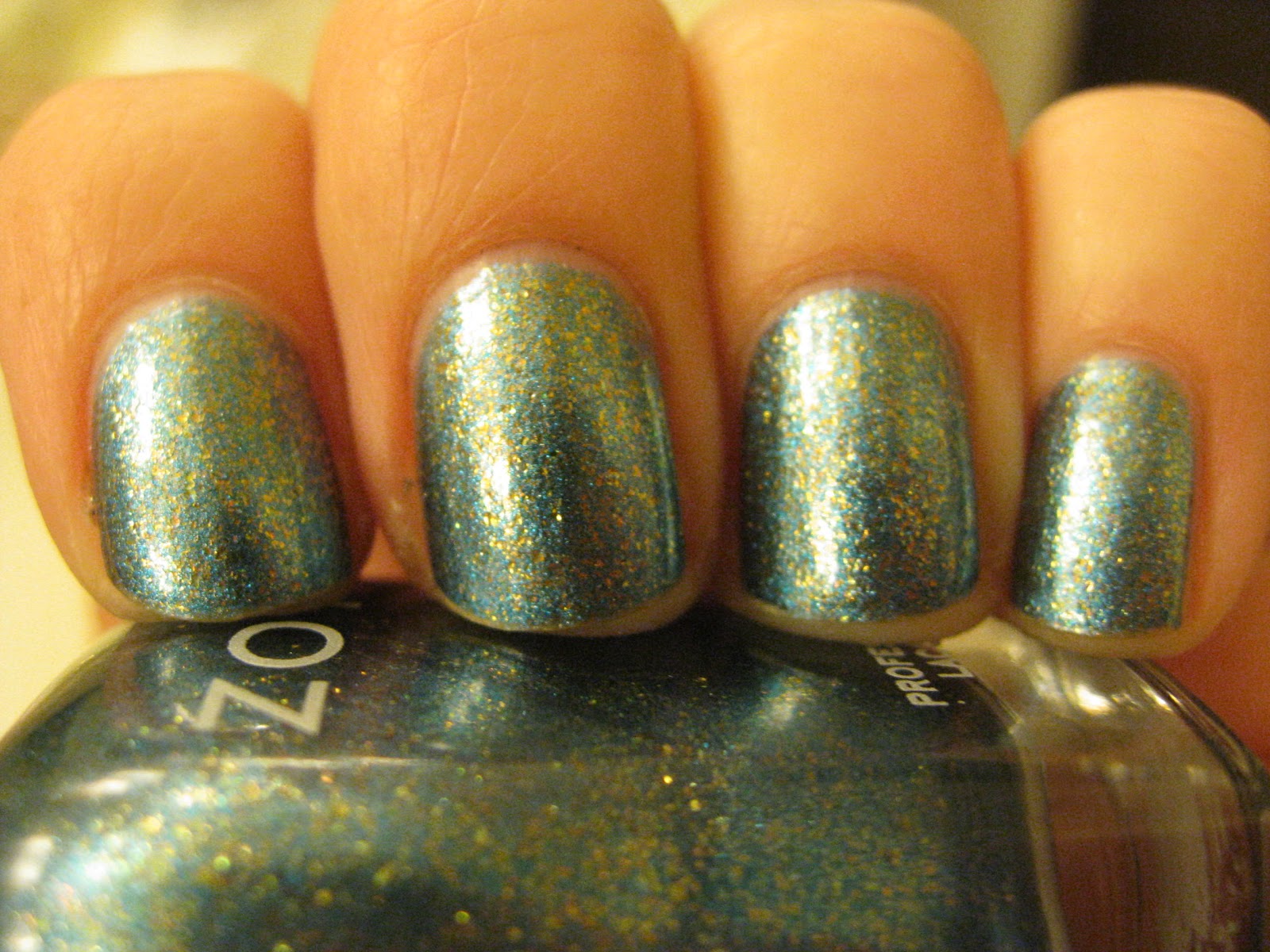
Zoya Crystal
Zoya Crystal is a beautiful blue and gold foil from the Flame Collection. You may also know that Crystal is an exact dupe for the hard-to-find, Euro-exclusive OPI Reflecting Pool. I had some peeling on my nails and wound up cutting them way shorter than I intended, so while I'm not thrilled about that, I am very happy with Crystal!
The formula on Crystal is fine; a little goopy here and there but still good overall. I used three coats for this mani. Unfortunately I was too lazy to use a basecoat and wound up paying for it when this stained my nails yellow pretty badly. So that's something I'll have to be mindful of next time.
Crystal reminds me of one of my favorite polishes, the increasingly rare OPI Absolutely Alice; same color combo, different finishes. Crystal also has a great shine to it and I love foils that have "freckles" of different colors in them. It makes them even more fun and interesting to look at!
The formula on Crystal is fine; a little goopy here and there but still good overall. I used three coats for this mani. Unfortunately I was too lazy to use a basecoat and wound up paying for it when this stained my nails yellow pretty badly. So that's something I'll have to be mindful of next time.
Crystal reminds me of one of my favorite polishes, the increasingly rare OPI Absolutely Alice; same color combo, different finishes. Crystal also has a great shine to it and I love foils that have "freckles" of different colors in them. It makes them even more fun and interesting to look at!
Subscribe to:
Posts (Atom)